The Monica Chronicles :
TYPOGRAPHY | VISUAL NARRATIVE | PHOTOGRAPHY | LAYOUT DESIGN | EDITORIAL DESIGN
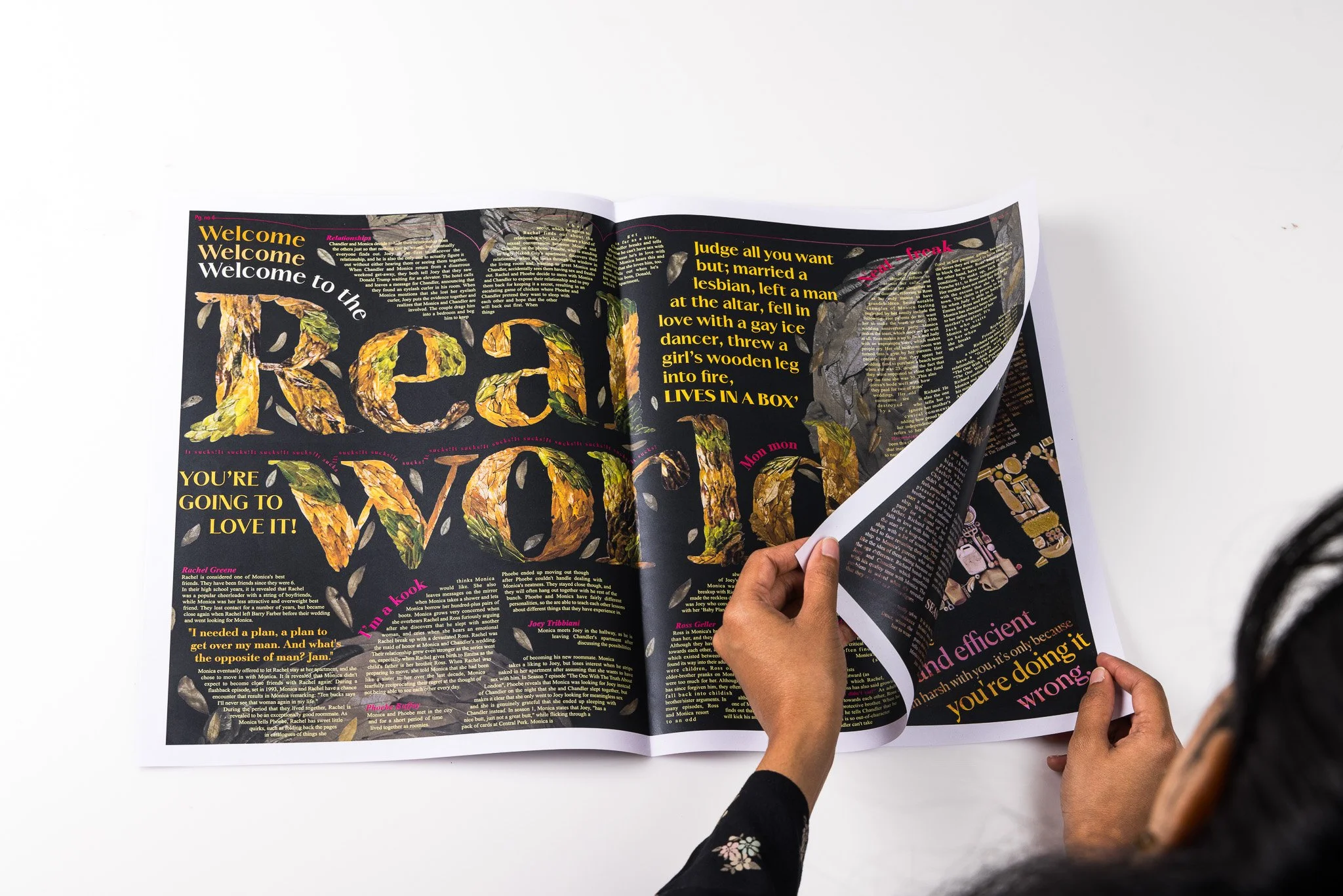
Real World
Monica’s sentiment to Rachel of ‘Real world’ is not as glamorous or perfect can be likened to the changing colors and patterns of leaves as they age, signifying the natural progression of life. Just as leaves transition through beautiful shades of green and brown, our lives also feature moments of beauty and challenge.
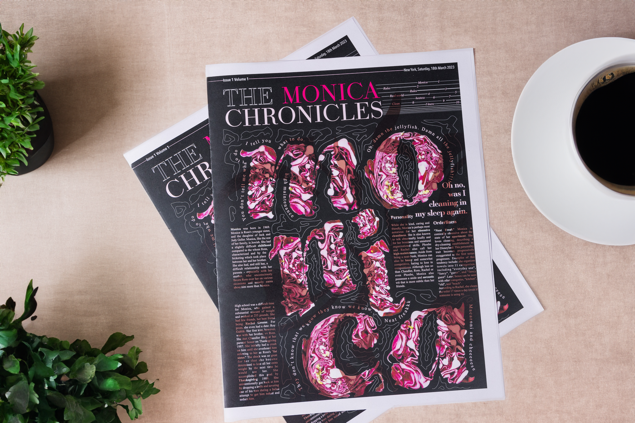
A Typographic Exploration- Monica Geller, portrayed by Courtney Cox in the beloved TV series 'Friends,' is a character cherished for her unique quirks and eccentricities. In this project, I delved into the multifaceted nature of Monica's personality by employing typography. The typographic elements I used were inspired by her well-known traits, including her meticulous and cleanliness-obsessed tendencies, her compulsive need for control, and her competitive spirit within her circle of friends.
2. Clean
Monica can go to any extend for cleanliness as she cleans others cars and houses, she can go an extend where she cleans the trash out of the trash can which is depicted below.
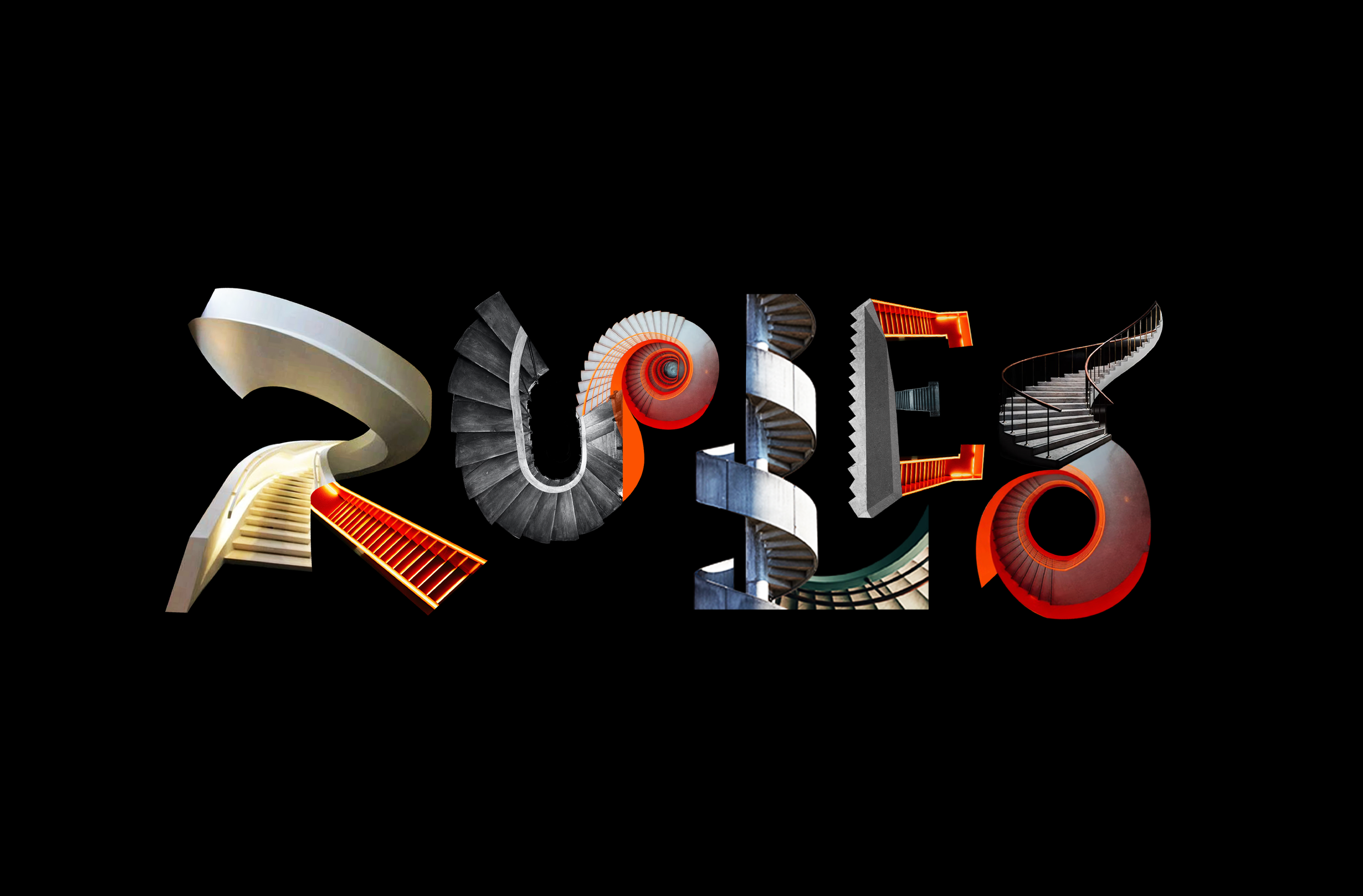
3. Rules
Monica is a stickler for rules, even when they don't make sense. She acts erratically if people don't follow the rules she sets. Her insistence on everyone following nonsensical rules, no matter what, often leads to confusion and chaos.
4. Hostess
Monica is a warm and welcoming hostess, but also strict with her home and can be tough on those who disrupt it. Like sea urchins, she is beautiful yet has the potential to prick others.
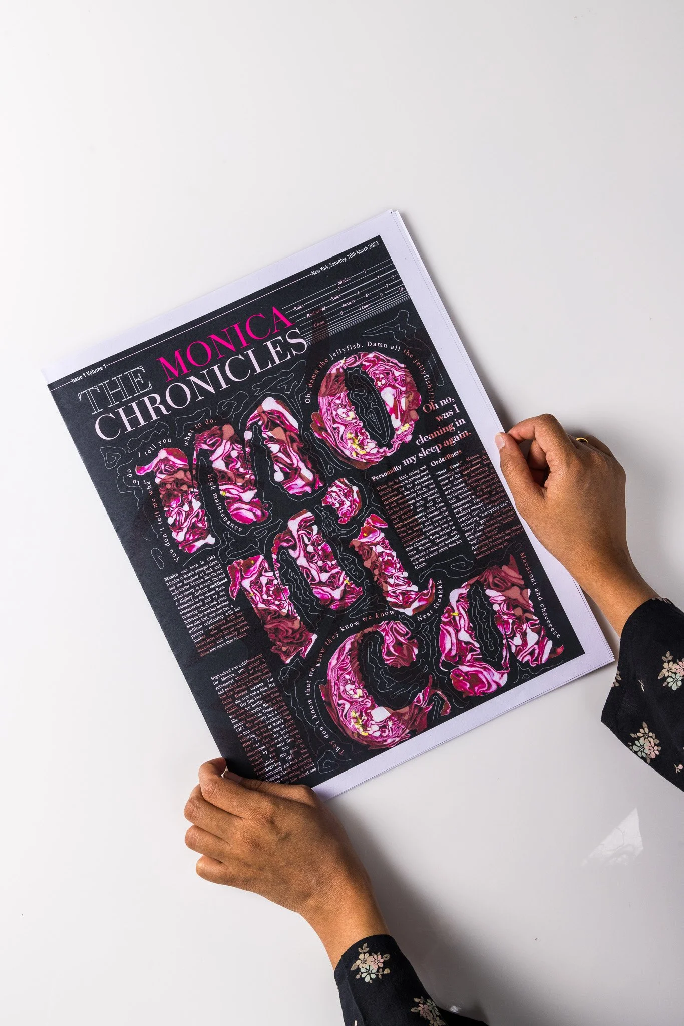
5. Monica
Monica's eccentricity is symbolized through bold typography and disordered cabbage imagery, conveying confusion. Her organizational prowess is renowned, yet her precision may seem unconventional. This is visually represented by intricate cabbage shapes.
6. I know
Monica is a powerful leader and exudes confident authority. Her words are potent, reflecting her commanding presence. Typography and colors mirror her assertiveness. When she says "I know!", it affirms her self-assured knowledge. The Visual elements used represent Monica's opinions.
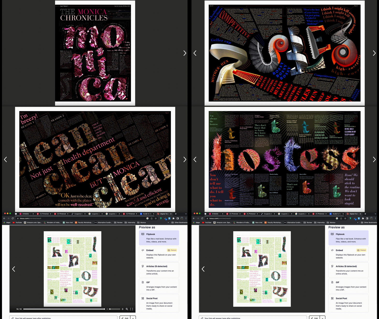
Newspaper Design
Giving a more contextual meaning to the typographic experiments by designing a newspaper and deconstructing it.
